ONCE UPON A TIMERETHINK YOUR BRAND
How Brand Storytelling Can Inspire Positive Change
Packaging is critical to dialogue between brand owners and consumers in the luxury market. And luxury brands can actually have a huge impact on their consumers by delivering messages about important social issues by leveraging their product packaging. Packaging can work as the perfect messenger that communicates a brand’s sustainability story.
Fairytales have always captivated people with their enchanting narratives and moral lessons. They’re not just stories—they serve as powerful tools for communicating and connecting with individuals. Throughout generations, these stories have been passed down, and their longevity comes from their ability to elicit emotional responses—and brands have quickly recognized the power of storytelling and how they can use it to their advantage.
After all, consumers are more likely to buy products if they are emotionally drawn to them, and what better way to do that than through a well-crafted narrative? In fact, a survey conducted by OneSpot found that 55% of people are more likely to buy products that tell a story.
Packaging and label designs are often the first points of contact between a brand and its consumers, so to inspire businesses to adopt this storytelling mindset, we recently collaborated with Avery Dennison (label materials), Supperstudio (design agency), KURZ (embellishments and print tooling), ESTAL (glass bottles), Etiquel (label print), Amorim Top Series (stopper/caps), Etinsa (label print) and Favini (premium fine papers), to develop eight beauty prototypes based on classic fairytales with a twist—all putting a spotlight on a social sustainability issue.
“Once Upon A Time” was born to inspire brands to innovate both in the use of materials and in the development of new applications to achieve truly innovative proposals,” explains Paco Adín, Creative Director of Supperstudio.
The project was a challenge for all the collaborators, as they had to think outside the box. “We knew we needed a disruptive proposal capable of communicating our expertise and becoming a partner for brands when seeking materials and solutions, especially in the Beauty sector,” adds Miguel García, BDM Premium Solutions at Avery Dennison.
So let’s explore these eight prototypes and their accompanying narratives.
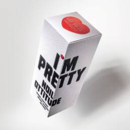
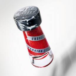
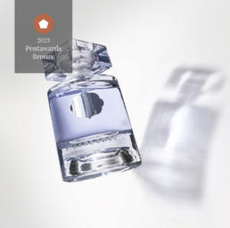
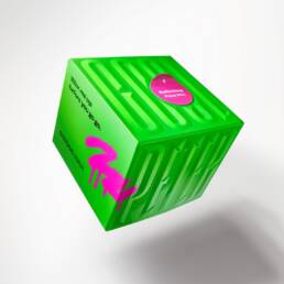
The first prototype, I’M PRETTY, is inspired by the fairytale ‘The Ugly Duckling,’ aimed to challenge conventional beauty standards and promote body positivity. It embraces the idea of being pretty as an attitude and encourages people to love themselves just the way they are. The prototype was developed with a unique approach called ‘Change everything without changing anything,’ which means shifting people’s perspective toward beauty without altering their physical appearance. In 2012, the ‘Body Positivity’ movement emerged, advocating for acceptance of all bodies, regardless of size, shape, skin tone, and physical abilities.
Printed on a coated material but with a very natural and uncoated look, this prototype reimagines The Ugly Duckling story to highlight the importance of raising awareness about ending social prejudices that can cause people to feel ashamed of their bodies.
LOVE ALWAYS WINS, on the other hand, is inspired by ‘Beauty and the Beast.’ It promotes the idea that love is a powerful force that can bring people together, heal wounds, and triumph over adversity. Love stories have always captivated audiences, and this prototype harnesses that force to inspire positive change, as living with love enriches relationships, builds trust, and creates a strong sense of unity.
In rethinking the story of Beauty and the Beast, LOVE ALWAYS WINS features an offset printing of 4 different pantones; a hot stamping of 4 different colours with a micro structure on one of them and finally embossing and stamping on different elements (rose, text, heart, colour blocks) of the folding carton. The message is clear: when we lead with love, we can overcome any obstacle, even in the most challenging circumstances.
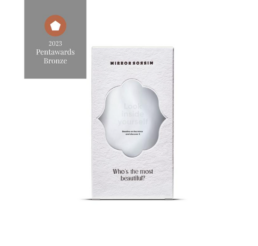
The third prototype, MIRROR MIRROR, is based on the classic fairytale “Snow White”. It challenges aesthetic norms and promotes the idea that true beauty comes from within. Kindness, empathy, sincerity, and love are the values that ultimately matter and lie beyond a mirror’s reflection.
The message of MIRROR MIRROR is that when we focus on developing our inner selves and embracing our unique qualities, we can become our most beautiful selves.
Overall, it’s a powerful example of how brands can inspire positive change.
For the production of this packaging, we have opted for a sustainable material made from 100% recovered paper (PCW). This uncoated recycled paperboard has a highly textured and ultra-natural surface. The debossing of the material itself embellishes the folding carton, which is printed in hot stamping in 1 black colour on the facing + embossing on the name of the prototype. Finally, a few labels with a mirror effect were perfectly placed on the exterior of the packaging, in the spaces created for this purpose, in order to illustrate and reinforce the message that this prototype wants to deliver.
Mirror Mirror won the Bronze award in the ‘Body, Health & Beauty – Professional conceptual work’ category in the Pentwards 2023 competition.
The fourth prototype, ANTIAGEISM, is inspired by “Rapunzel” and challenges age-related biases. It stresses that age is neither a defining characteristic nor a barrier to a fulfilling life, encouraging people to live without any complexes.
In rethinking Rapunzel, who, in some versions of the fairytale, has the power to reverse aging, the prototype highlights the importance of challenging age-related stereotypes.
The message of ANTIAGEISM, which is printed on an uncoated material with a textured and ultra-natural look, is that age should not define us, inspiring people to break free from societal expectations and live on their own terms, leading to a more accepting and inclusive society.
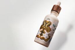
The packaging features a magnificent illustration printed in 4-colour offset + 1 pantone colour as well as a superb 4-colour hot stamping on the creasing, all enhanced by an embossing, a debossing, as well as a multi-level embossing on various elements of the hot stamping decoration. A beautiful technical exercise we are very proud of.
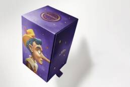
The HONEYSTY prototype draws influence from ‘Pinocchio’ and urges people to be true to themselves. It reinforces the idea that honesty and following your conscience can take you far and that we cannot be blinded by the constant stream of trends we’re fed on social media. Ultimately, HONEYSTY is a powerful example of how brands can inspire authenticity and how prototypes such as this can evoke self-acceptance and honesty.
The packaging created for this prototype is composed of two nesting pieces. A purple ribbon, matching the purple background colour of the pack, and woven in cotton, has been placed on the base of the inner box to make the pack easier to open. Inside is a beautiful handmade honey scented candle, crafted in premium glass and adorned with a custom made cork stopper. In terms of printing and finishing, this packaging is once again ultra complete as it features four-colour offset printing + a purple pantone (background) and matt varnish on a high-quality, uncoated 100% virgin fibre cardboard with a natural look. The superb illustrations of Pinocchio, created especially for this project, feature a multi-level embossing of the cardboard imitating the texture of wood, the result being a delight for the eyes and senses. The entire packaging has also been hot foil stamped with 3 different colours, highlighting the name of the prototype and details such as the stars and bee cells appearing throughout the pack. The final touch is Pinocchio’s nose: when the small purple cotton ribbon is pulled, the inner box opens and on one of its sides appears Pinocchio’s nose, which gets longer as the pack is opened, to finally reveal a bee on the tip of the nose, reminding us of the scent of the candle, and the name of our prototype “Honey-sty”.
Honeysty not only won bronze in the ‘Home, Leisure & Other Markets – Self promotion’ category but also earned the People’s Choice Award in the ‘Brand Identity & connected packaging’ category in the Pentawards 2023 competition.
With TWELVE O’CLOCK, we encounter a modern twist on the fairytale ‘Cinderella.’
The prototype conveys the idea that in this day and age, we have the freedom to decide when we get home, and we can take control of our lives. It symbolizes empowerment and the ability to take charge of your destiny and make your own decisions—unlike Cinderella, who had a strict curfew.
For this packaging we have opted for a high quality, midnight blue, mass dyed paper made from 100% cotton fibres. The pure cotton paper has a very soft look and feel and is ideal for deep embossing. This prototype, with its padded design & holographic hot stamping all over the folding box, emphasizes the importance of not waiting for someone else to make our dreams come true.
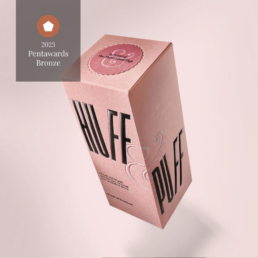
The second-to-last prototype, HUFF AND PUFF, is inspired by the fairytale “The Three Little Pigs” and addresses prejudiced beliefs.
It emphasizes that there is no single lifestyle or perspective, and it’s time to respect and stop judging others for living by their own rules.
The prototype’s slogan, “I’ll huff, and I’ll puff until your prejudice crumbles,” highlights the importance of breaking down preconceived notions and biases and promoting inclusivity.
By doing so, HUFF AND PUFF aims to evoke change and showcase how brands can use packaging and labels to promote a more tolerant and accepting society.
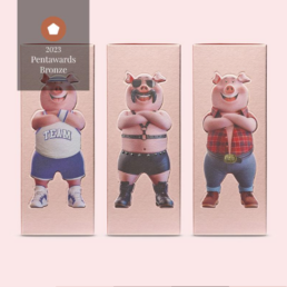
Printed on high-quality, mass-dyed, light pink material made from 100% virgin fibres, this series of 3 folding boxes -each personalised with a fresh and modern illustration of the three little pigs- features matt black hot stamping to state the name of the prototype and the series number, as well as covering white hot stamping on the folding zone, which is normally very delicate and not very suited to this type of finish. Smooth velvety Fasson® papers from Avery Dennison were used to illustrate and reproduce the three little pigs.
Huff&Puff also won the Bronze award in the ‘Body, Health & Beauty – Professional conceptual work’ category in the Pentwards 2023 competition.
The final prototype, PETER PUNK, embodies the rebellious spirit of Peter Pan.
This daring concept encourages individuals to leave stereotypes and prejudices behind, embracing the world with an insatiable desire for new experiences, learning, and discovery.
It combines the magic of Peter Pan’s eternal youth with the punk ideology of challenging societal norms, inviting you to embark on your own journey of self-exploration and growth.
Printed on a prestigious super smooth and mirror gloss surface material, the packaging showcases a vivid design and daring message, serving as a potent reminder that sometimes, the most memorable stories are those that stray from the path of tradition.

Talking about the importance of all of the stories behind these prototypes, Paco explains: “Every concept aims to improve society. Maybe the fairytales don’t end as we’ve been told – maybe there was always more to these tales, and we have to rethink and adapt them to the 21st century”. Moreover, Miguel discusses this opportunity for brands: “Today’s consumers are looking for new experiences, so brands that delight them, align with their values, and are a reflection of our society, will succeed. Many brands want to be part of the real lives of their customers, so they need to listen to their concerns and find solutions that make their lives easier.”
But storytelling alone isn’t enough for today’s buyers. According to a survey conducted by Accenture, 60% of global consumers prefer to purchase products from eco-friendly and socially responsible companies. Additionally, it found that consumers are willing to pay a premium for products that come in sustainable packaging. “Sustainability and visual appeal are not mutually exclusive” adds Paco. “The concept of responsible consumption is becoming increasingly prevalent among consumers, so brands must facilitate this process by seeking solutions that meet their needs. Each choice, such as a type of material, for example, or print finish, must convey to the customer that every design component has a differentiating value that connects the brand authentically with its audience”.
However, do brands nowadays genuinely understand the value of sustainability—particularly in the world of luxury? According to Miguel, luxury is not understood in the same way as it was in the past. “In Today’s world, ethics are as important as aesthetics, and the luxury industry is no exception. New consumer types drive current luxury designs, and sustainability is a non-negotiable for them. It’s critical to understand that sustainability doesn’t mean giving up on design quality” he explains.
For Once Upon A Time, the use of sustainable materials was combined with a careful selection of printing techniques and finishes, and the use of specialized partners such as KURZ for the finishes, EGISA for the production of the folding cartons, Etinsa and Etiquel for the printing of the labels, Estal for glass containers and Favini for some of the papers. Each material was carefully selected to convey a message through its texture, color, and finish, reinforcing the brand’s engagement with the consumer.
In conclusion, Once Upon A Time is a project that inspires brands to think differently about how they connect with their consumers through design. It serves as a reminder that sustainability and visually appealing products are not incompatible and that brands must be conscious of their impact on the environment and society. Fairytales offer valuable lessons for brands on how to connect with their consumers through design, and by creating a narrative around their products, they can differentiate themselves from their competitors, establish an emotional connection with their customers, and ultimately drive sales. So, if you’re a brand or designer looking to create a lasting impression, take a page from the fairytale playbook and let your packaging and label designs tell a story that resonates with your target audience. Remember, a good story can capture the hearts and minds of customers and, in turn, boost brand loyalty.


